

Life Cycle Assessment
Interface Redesign
Total Materia - Green Line Module
INITIAL STATE
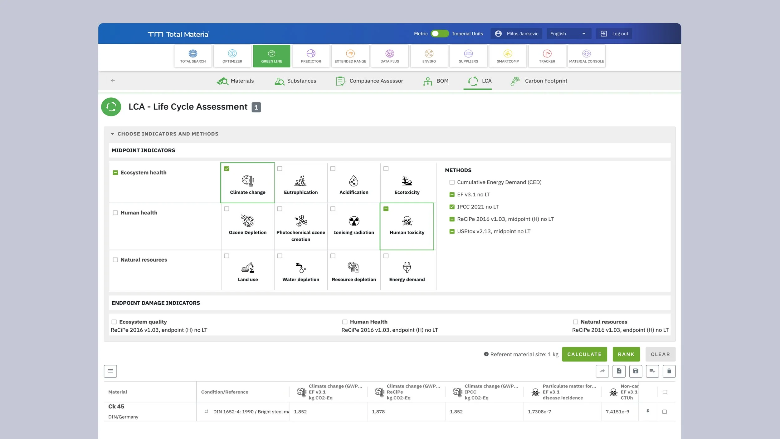
The Life Cycle Assessment tool within Total Materia's Green Line module enables engineers and sustainability professionals to calculate environmental impact indicators for materials across their lifecycle. Users can assess materials against over 40 different environmental indicators spanning three major categories: Ecosystem Health, Human Health, and Natural Resources.
However, the original interface struggled with a fundamental design challenge: how to present such a large set of options without overwhelming users. The solution at the time was to hide indicators behind collapsed accordion menus, requiring users to click through each category to discover what was available. This created a frustrating experience where users couldn't get a clear overview of their options without multiple interactions. The results table compounded this issue with a dense, merged-cell layout that organized data by material rather than by the logical indicator groupings users needed to understand their environmental impact assessment.
THE ASK
The client approached me to redesign the indicator selection interface with a clear mandate: make 40+ indicators accessible and understandable without overwhelming the user. They wanted to maintain the existing workflow—select a material composition, choose relevant indicators, and calculate results—but needed a solution that would reduce friction, improve discoverability, and make the results easier to interpret. The core calculation logic and data structure had to remain intact, meaning the solution needed to be purely interface-driven while dramatically improving the user experience.
SOLUTION & IMPROVEMENTS
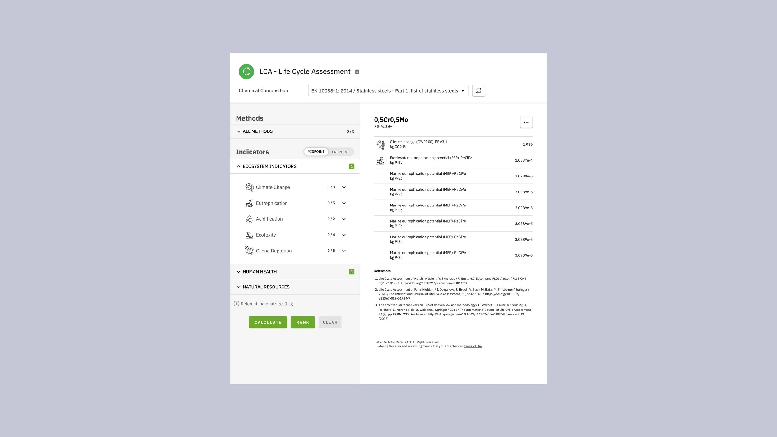
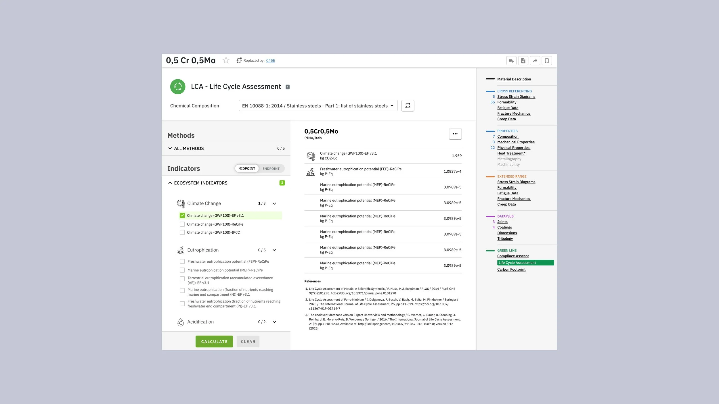
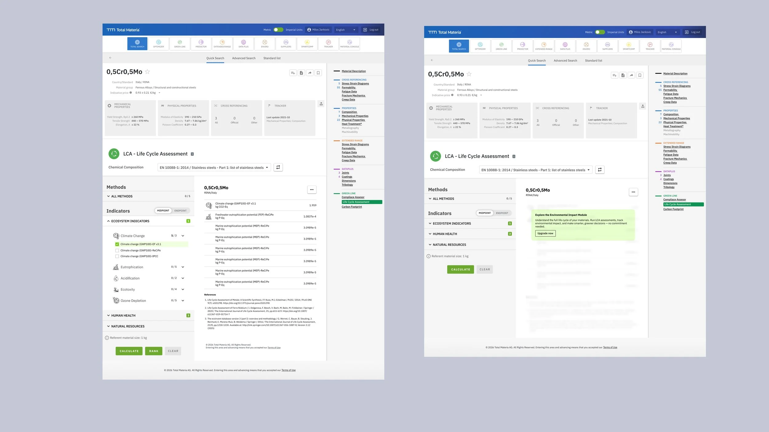
The fundamental shift in my approach was to prioritize visibility over space-saving. Rather than hiding indicators behind collapsed menus, I redesigned the interface to display all 40 indicators simultaneously in a clean, organized layout. Category headers still provide collapsible functionality and show selection state (like "Climate Change 3/5"), but the indicators themselves remain visible, allowing users to scan the entire landscape of options at a glance. This eliminated the cognitive burden of trying to remember what options existed behind each closed accordion.
For the selection mechanism, I introduced a simple and direct interaction pattern. Each indicator has a clear "+" button for quick addition, with real-time counters showing selection progress per category. When an indicator has multiple variants or methods (such as different Climate Change calculation approaches), a modal overlay presents these options in a focused context, preventing the main interface from becoming cluttered while still maintaining transparency about available choices. A "Select All" option serves power users who want to run comprehensive assessments.
The results display received equal attention. Instead of grouping results by material with merged cells creating visual complexity, I reorganized the data by indicator category. Related indicators and their calculation variants now appear together, making it easier to understand environmental impact across different dimensions. Better visual spacing and a cleaner table structure eliminate the scanning difficulties that plagued the original design, allowing users to quickly find and compare the values that matter most to their assessment.
The impact of these changes extends beyond mere aesthetics. By reducing the interaction cost—eliminating expand/collapse cycles—users complete their tasks faster and with greater confidence. The immediate visibility of all options supports better decision-making, as users can quickly identify and select the most relevant indicators for their specific assessment needs. The interface now matches the technical sophistication of the underlying environmental data, presenting complex information in a way that feels both professional and approachable.