
Insurance Platform Redesign
Making a complex product portfolio accessible to everyday users — Wiener Städtische
INITIAL STATE
Wiener Städtische osiguranje is the Serbian representative of one of Austria's most established insurance groups — a brand that carries genuine weight in the market. The digital presence didn't reflect that weight. The website felt like a collection of disconnected microsites rather than a coherent platform, with navigation that forced users through multiple layers to reach basic product information.
For an insurance company, that friction is particularly damaging. Users arrive with a specific need — understanding coverage, comparing options, getting a quote — and leave when the interface doesn't respect their time. Trust, which is the core currency of insurance, erodes before a single product page is reached.
THE ASK
A complete redesign of the digital platform covering a vast product portfolio — individual insurance across health, life, property, vehicles, and travel, plus comprehensive business coverage. My role spanned the full scope: information architecture, content strategy, visual design system, and mobile experience. The additional constraint was bridging Vienna Insurance Group's existing brand guidelines with contemporary visual language appropriate for the Serbian market.
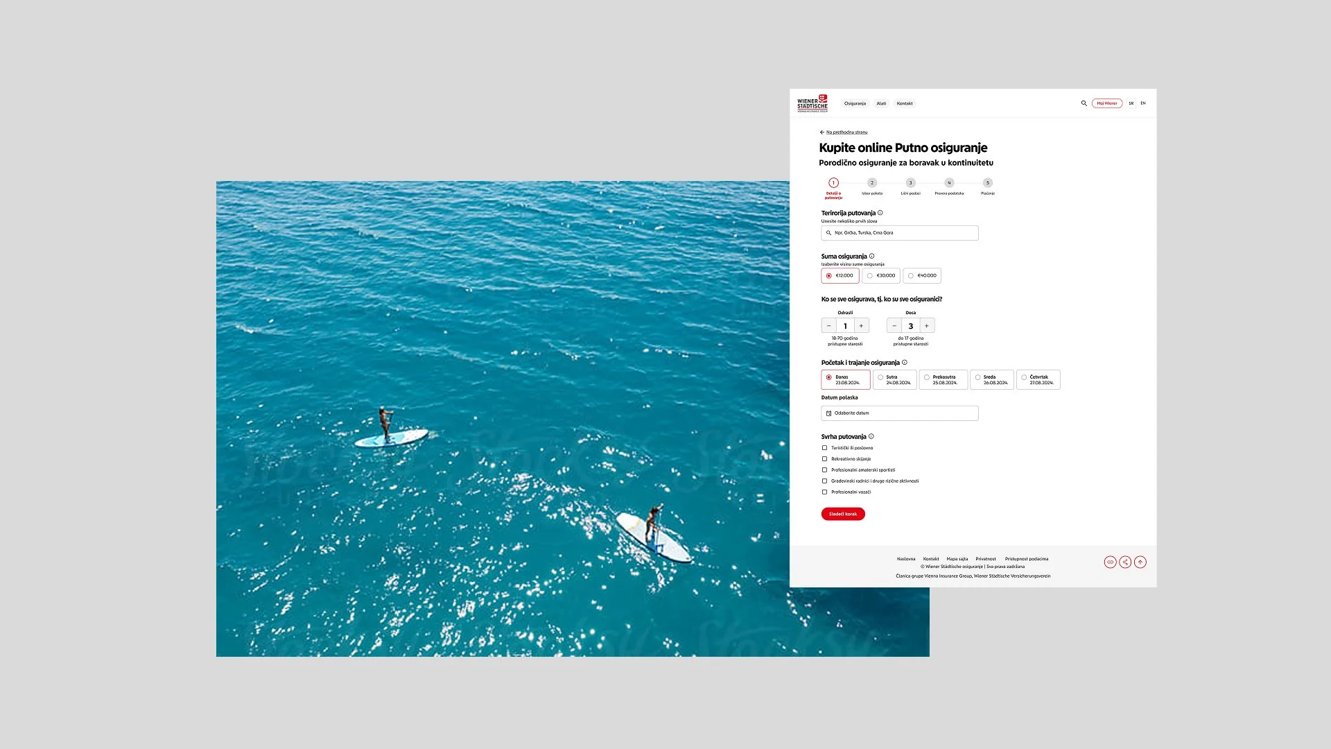
SOLUTION
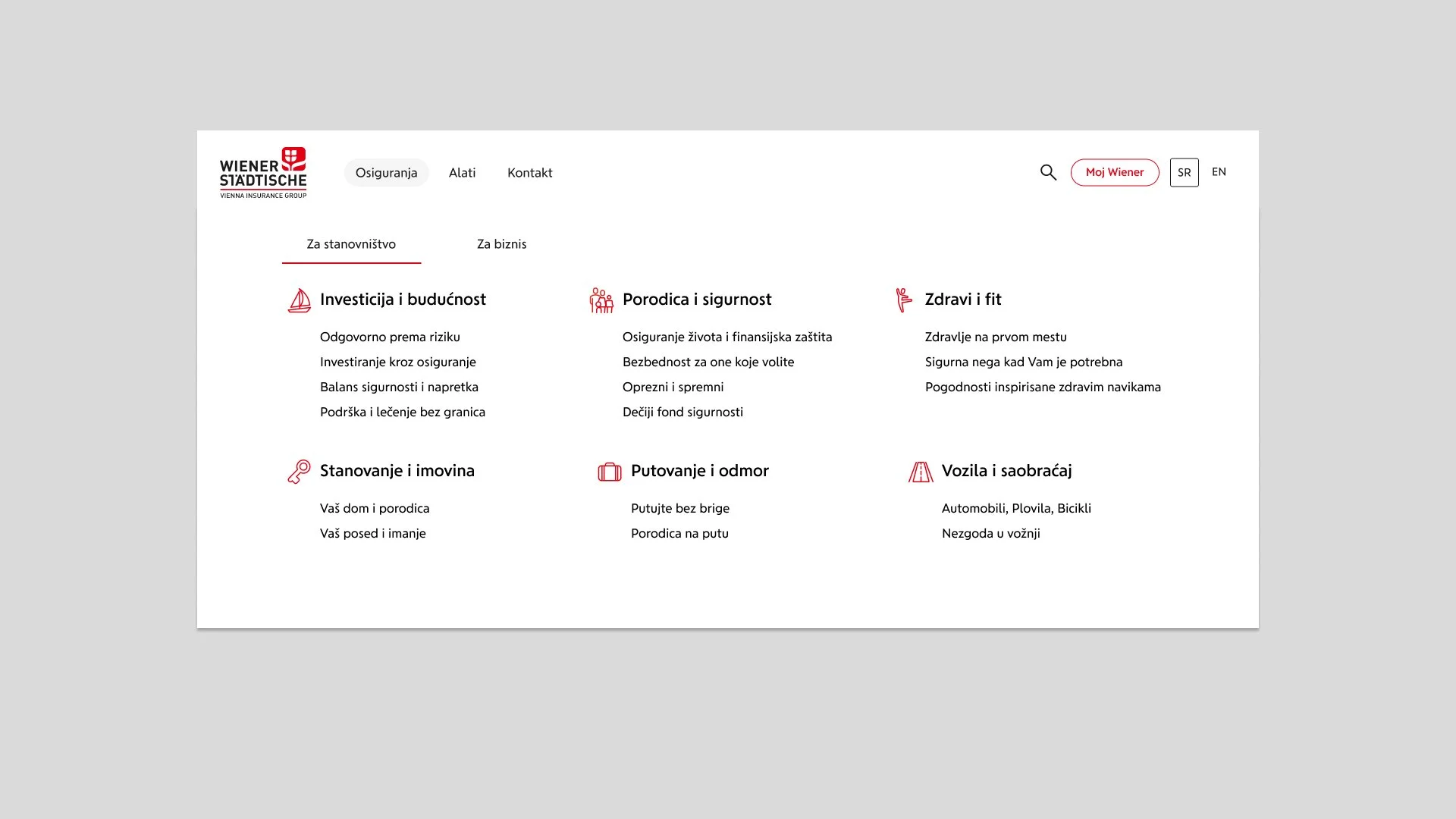
The primary structural decision was to split the platform into two clear paths from the entry point — individual consumers and business clients. This single change immediately reduced cognitive load by showing each user only the insurance categories relevant to their situation. Within each path, products were organized around life contexts rather than insurance industry taxonomy. "Healthy and Fit," "Home and Property," "Driving and Travel" speak to actual user needs — not policy types that only make sense to underwriters.
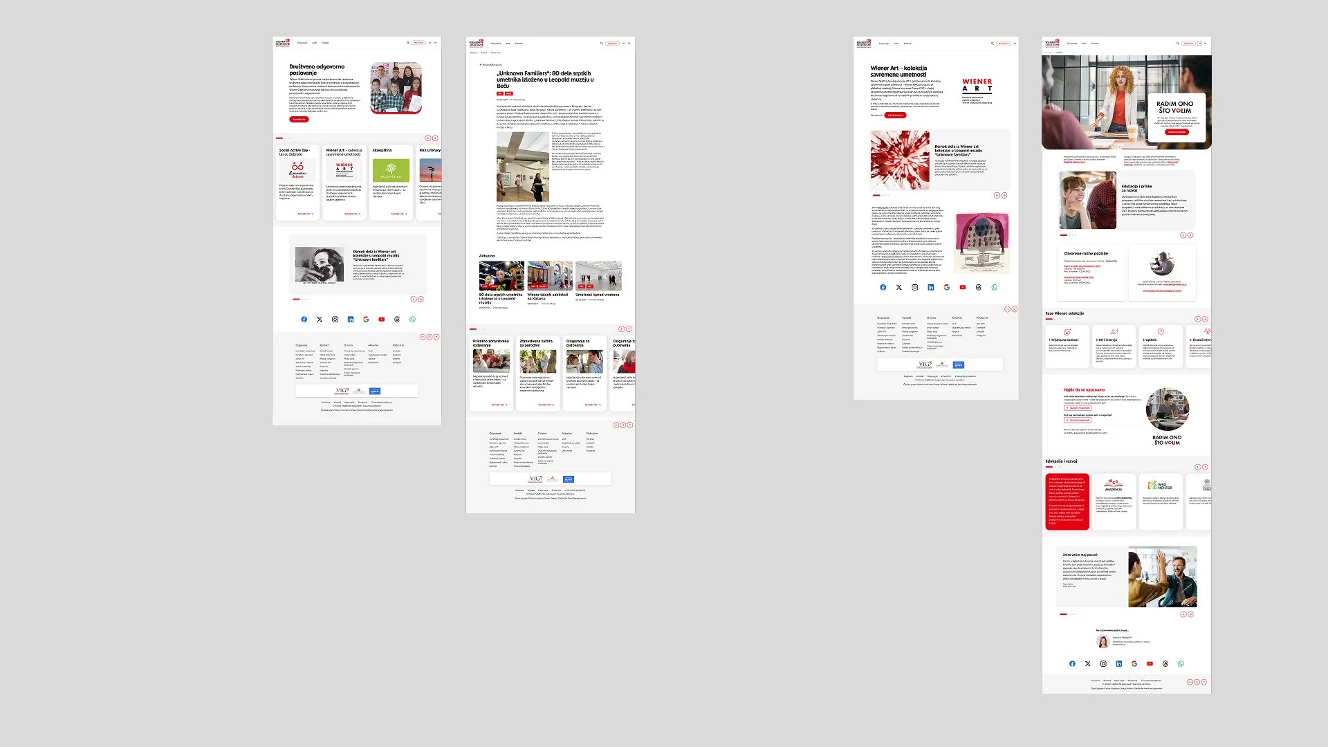
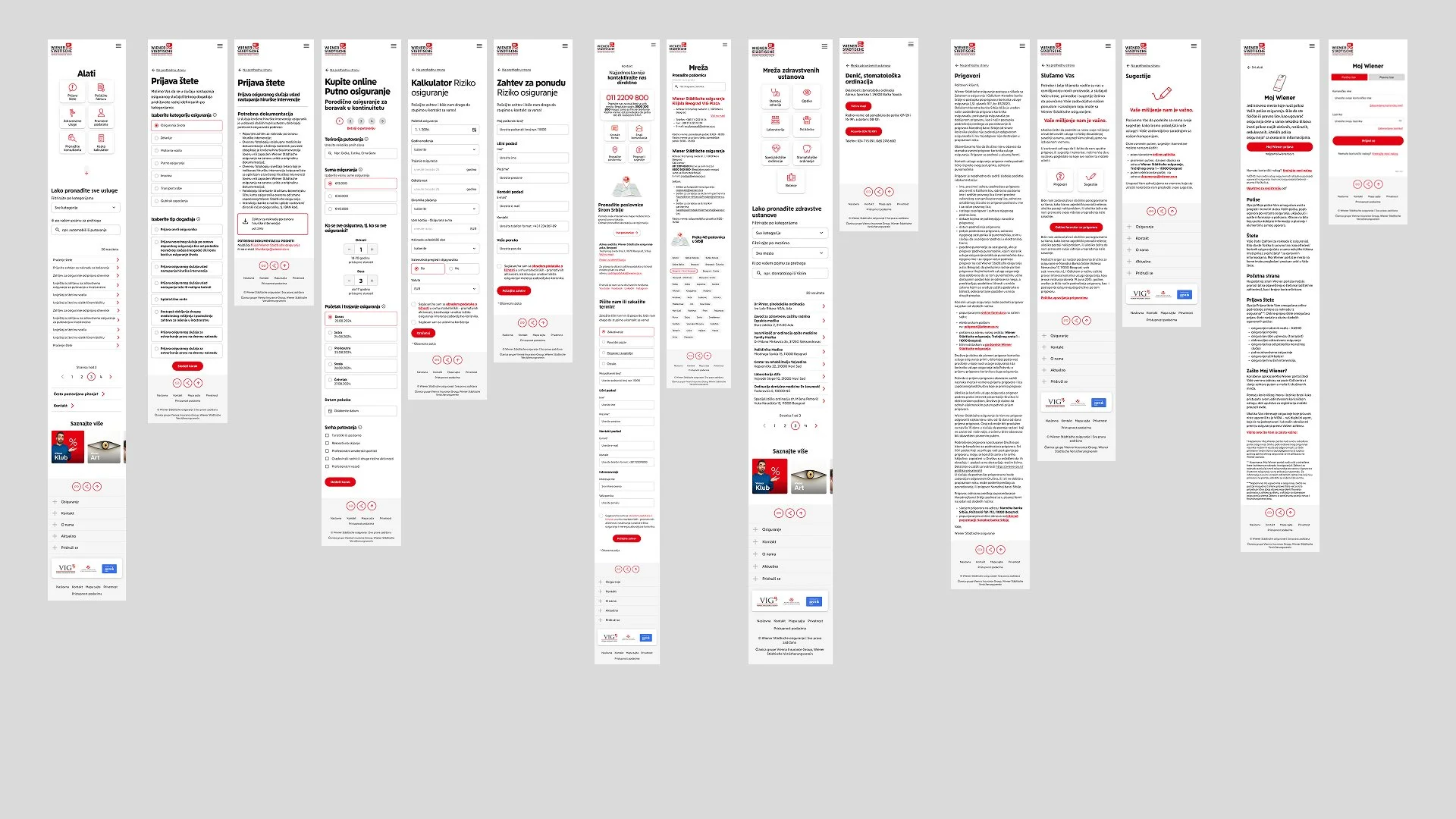
Navigation was rebuilt around a mega-menu structure that reveals the full product hierarchy in a single interaction. Users could scan all offerings at once rather than clicking through nested menus hoping to land in the right place. Each product received a dedicated landing page with consistent structure: clear value proposition, practical coverage details, and an immediate path to a quote — no dead ends.
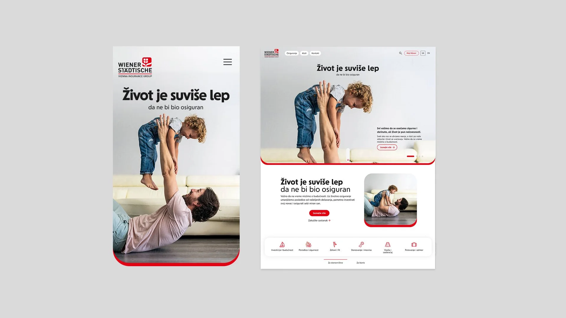
Content was radically shortened. Long paragraphs of jargon-heavy text became concise benefit statements. The mobile experience was designed independently rather than adapted from desktop — touch targets sized correctly, forms simplified for small screens, critical information surfaced without scrolling.
IMPACT
The redesigned platform gave Wiener Städtische a digital presence that matched their market position. The two-path architecture eliminated the confusion of a one-size-fits-all structure serving fundamentally different user needs. Reduced navigation complexity meant users reached relevant product information faster — and for an insurance platform, faster path to information means faster path to trust.