
Real Estate Investment Platform Redesign
Making Scandinavian crowdfunding accessible to retail investors — Kameo
INITIAL STATE
Founded in 2014, Kameo had built a credible position in the Scandinavian fintech market — connecting real estate developers needing flexible capital with private investors seeking returns above traditional banking products. The business was mature. The platform wasn't.
The interface created unnecessary friction at exactly the wrong moments: when an investor was evaluating a new opportunity, or when a construction company was trying to present a project compellingly. Visual identity felt generic for a platform handling significant capital decisions. The gap between Kameo's market reputation and their digital experience had become a business problem.
THE ASK
A complete platform redesign spanning two distinct but connected surfaces — the public-facing website where investors discover and evaluate opportunities, and the authenticated web application where they manage active investments. The challenge: create an experience that makes real estate investment feel accessible to retail investors like a teacher from Göteborg putting her savings to work, without losing the sophistication that corporate treasury departments and construction companies expected.
The project ran parallel to an external rebranding effort, adding complexity. Brand guidelines were intentionally minimal — giving me both creative freedom and responsibility to extend the identity system in ways that would serve the digital product.
SOLUTION & DESIGN APPROACH
The core design decision was to separate the two user groups — private investors and construction companies — at the earliest possible point, then design each journey independently while maintaining a shared visual language.
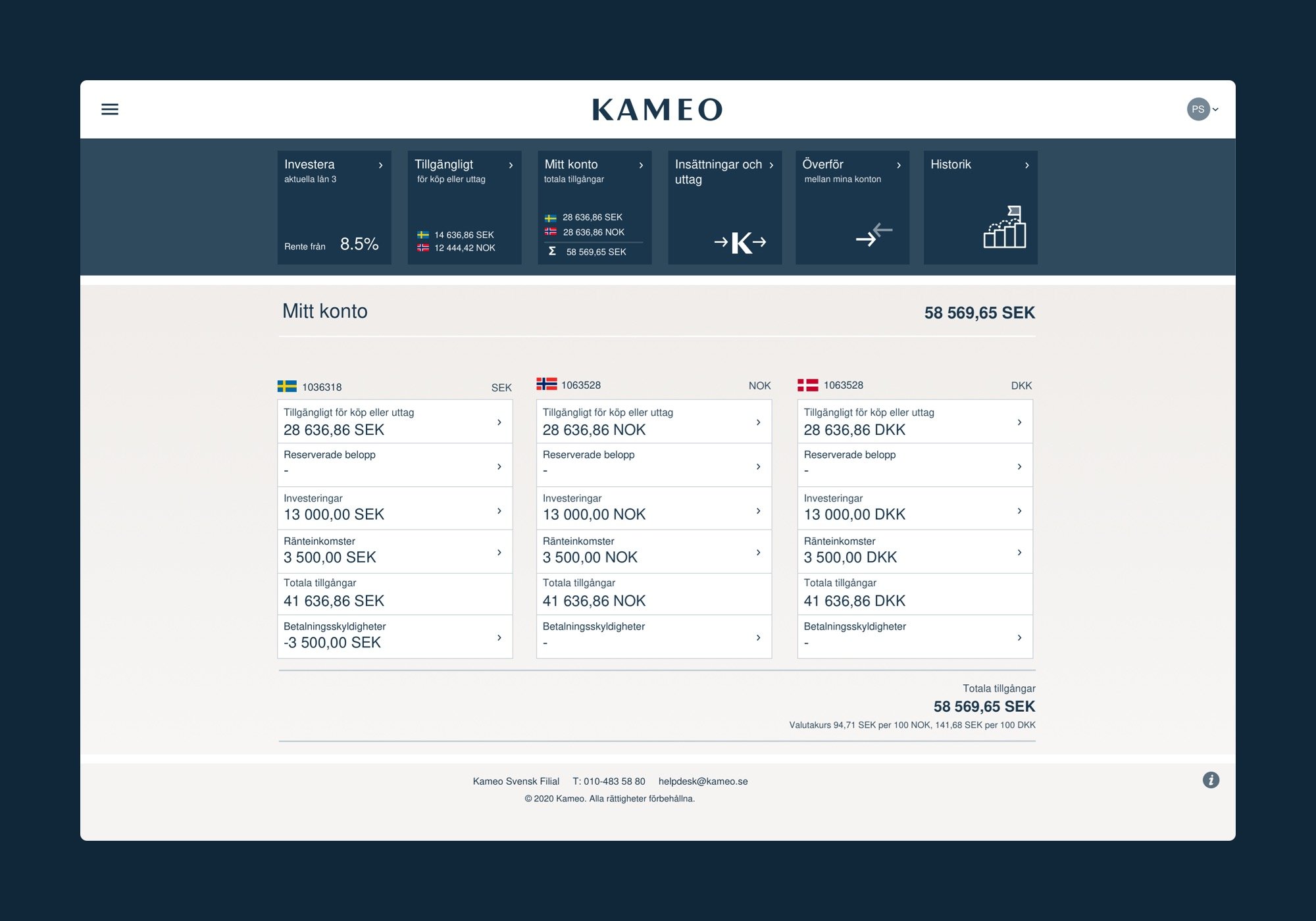
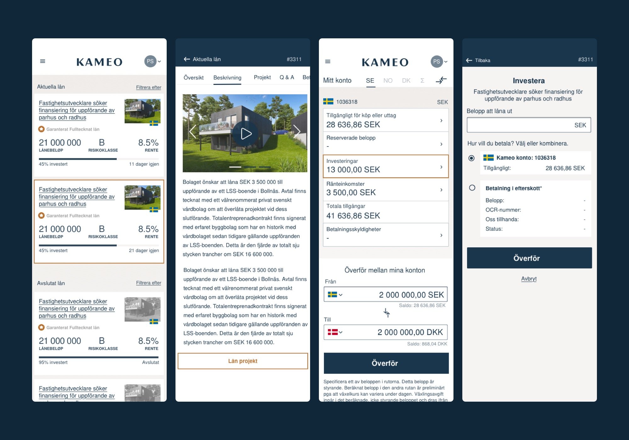
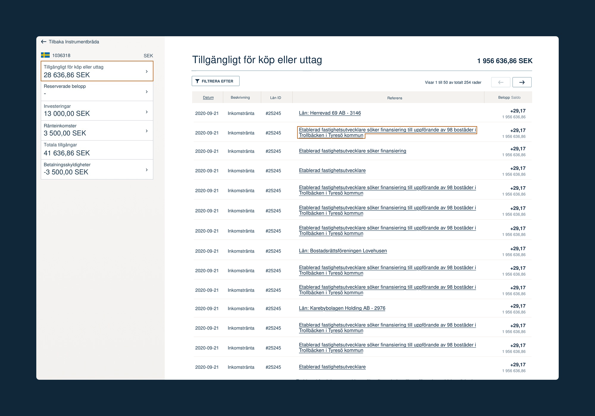
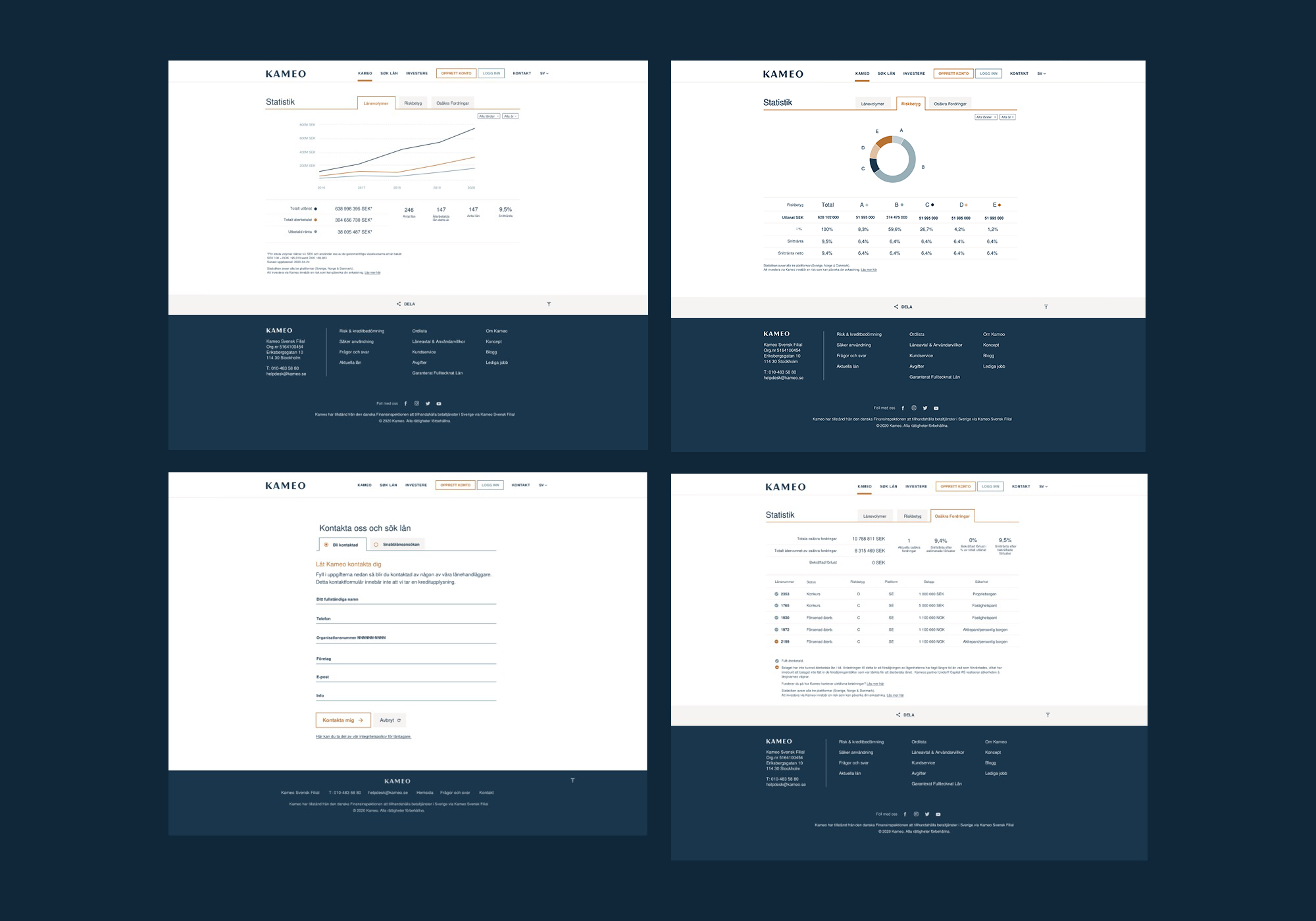
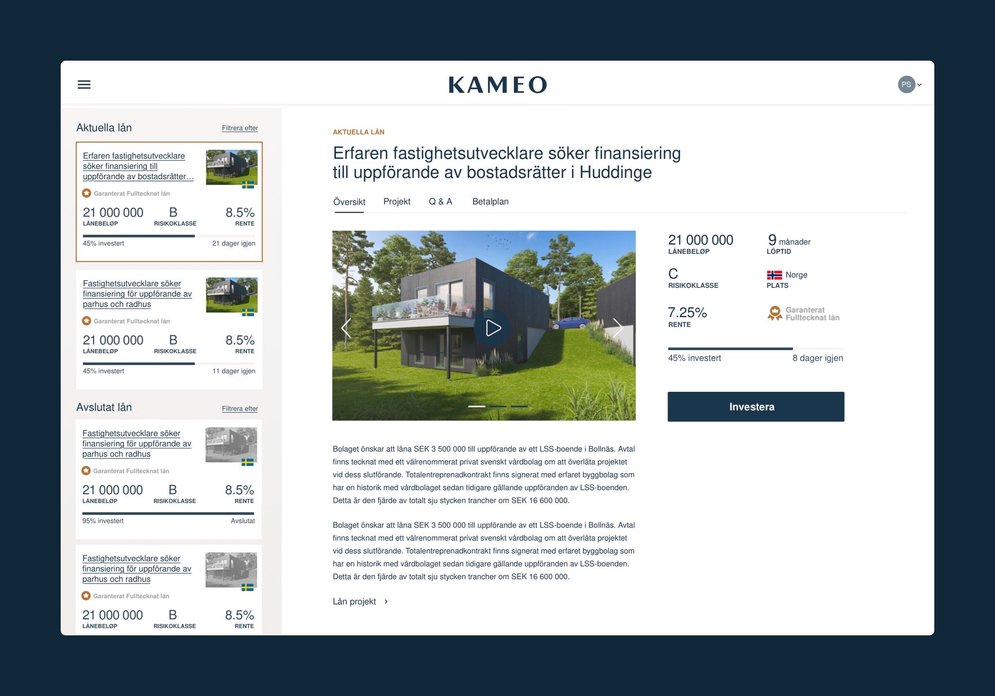
For investors, the focus was on confidence at the point of decision. Project listings were restructured to surface the information that actually drives investment choices: return rate, loan term, collateral type, and funding progress — visible without requiring users to dig into project detail pages. Risk indicators were made explicit rather than buried in documentation. The overall effect was a platform that respected the seriousness of the decision rather than softening it.
For construction companies, the experience shifted from transactional to partnership-oriented. Project submission flows were redesigned to help companies present their projects compellingly, with clear guidance on what information builds investor confidence.
The visual identity extended the minimal brand guidelines into a system that communicated credibility without formality — appropriate for a platform where users are trusting it with meaningful capital.
IMPACT
The redesigned platform aligned Kameo's digital presence with their actual market position for the first time. Investors encountered a product that matched the professionalism of the underlying financial service. The clearer information hierarchy reduced the cognitive load of investment decisions, and the separated user journeys eliminated the confusion of a one-size-fits-all interface serving two fundamentally different needs.